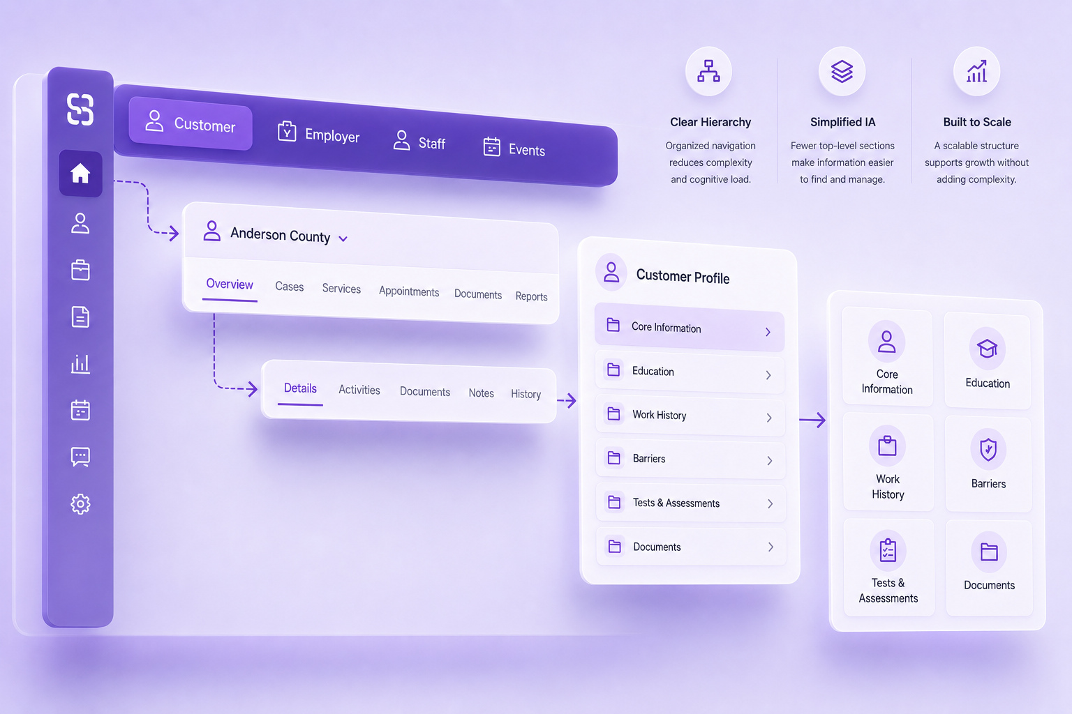
Navigation within the Customer experience had evolved incrementally rather than as a unified system. Global navigation, contextual controls, nested destinations, and increasingly granular tabs competed without a clear hierarchy, while new functionality often meant adding another destination or tab. The result was increasing navigation density, hidden overflow states, and more effort required to understand where information lived.
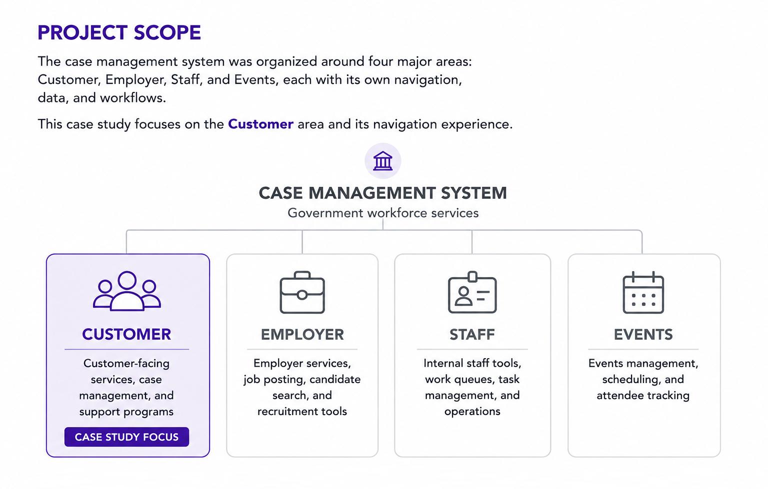
The platform was organized around four major areas: Customer, Employer, Staff, and Events, each supporting its own navigation, data, and workflows. This case study focuses on the Customer area, specifically the Customer Dashboard and the navigation architecture surrounding it. The work also extended deeper into Customer workflows, including restructuring the Customer Profile information architecture.
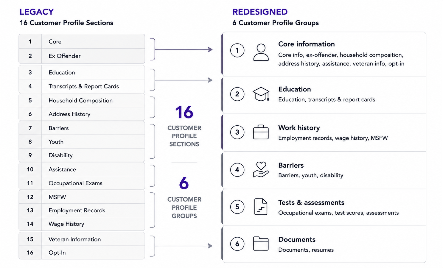
Before redesigning the navigation UI, we first reduced the complexity it needed to support. Moving the same fragmented structure into a new component would only relocate the problem, so within the Customer Profile, I worked with the team to consolidate 16 top-level sections into 6 functional groups before applying the new navigation model. The consolidation was based on frequency of use and the logical relationships between tasks, bringing frequently used workflows forward while reducing the prominence of secondary functions.
With the underlying information structure simplified, the next step was defining clear responsibilities for each level of navigation.
The Customer experience had accumulated multiple navigation mechanisms, each handling a different part of moving through the product:
As features accumulated, these mechanisms increasingly competed for attention and made the hierarchy harder to understand.
Note: Interface mocks and workflows shown here are simplified abstractions created to illustrate interaction principles and layout strategy. They do not reflect final production code or proprietary data.
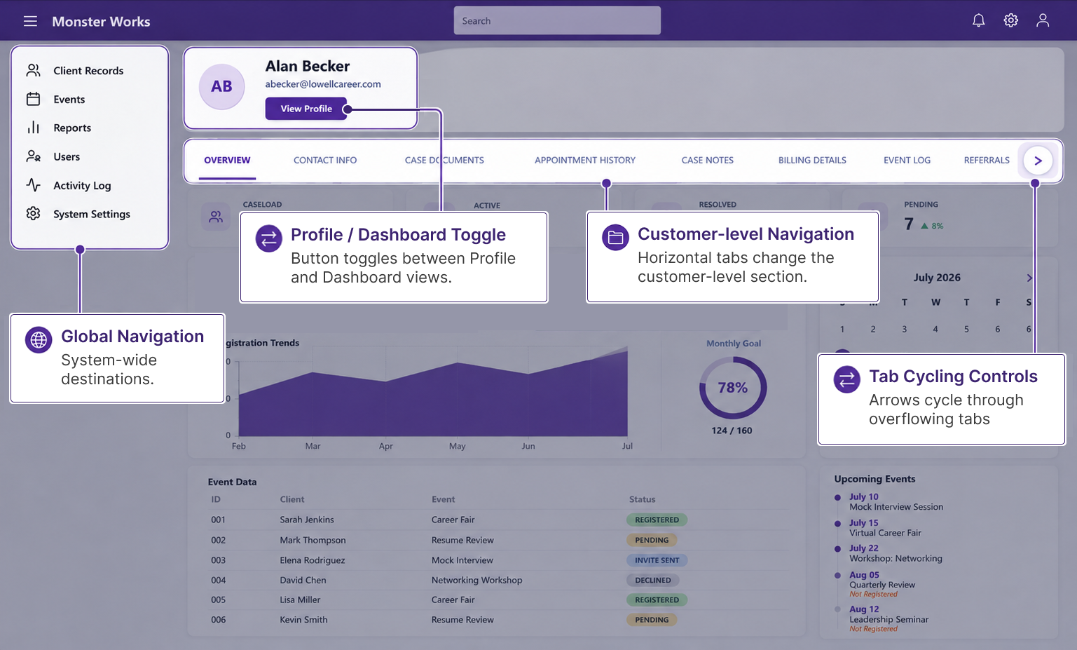
The redesign gave each navigation layer a distinct responsibility, reducing the overlap between mechanisms that had accumulated in the legacy experience:
We explored several navigation models before settling on the final architecture. Flyout navigation proved difficult to use, extending the menu to the right consumed valuable screen real estate, and replacing the left-hand menu with each successive level was disorienting and made it easier for users to lose their place. The final approach preserved context while keeping the interface compact for data-dense workflows.
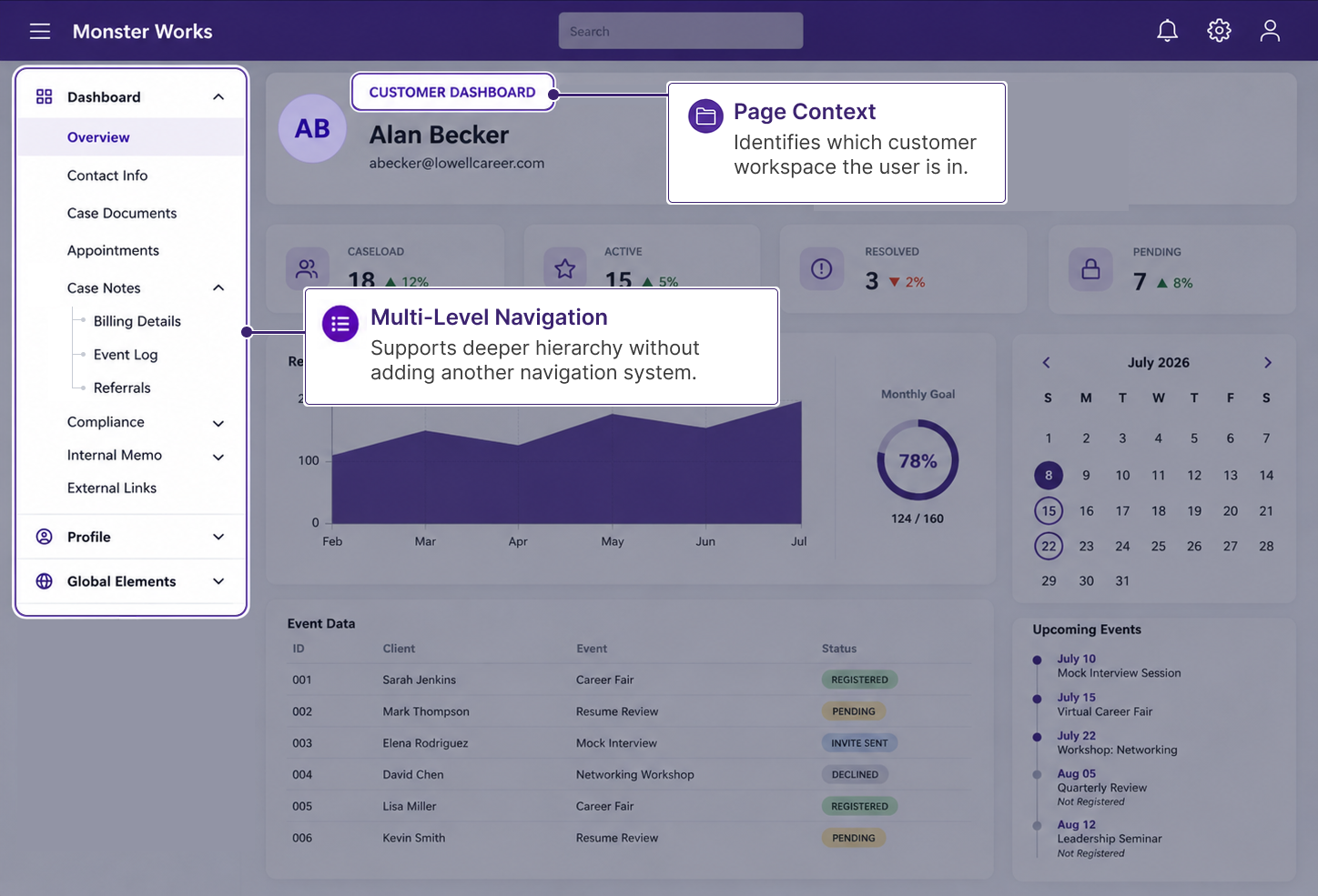
The navigation keeps both the customer and the current section visible as users move through the experience. The customer name maintains the entity context, while the eyebrow header distinguishes between areas such as Customer Dashboard and Customer Profile. Related destinations are then organized within the contextual and nested navigation.
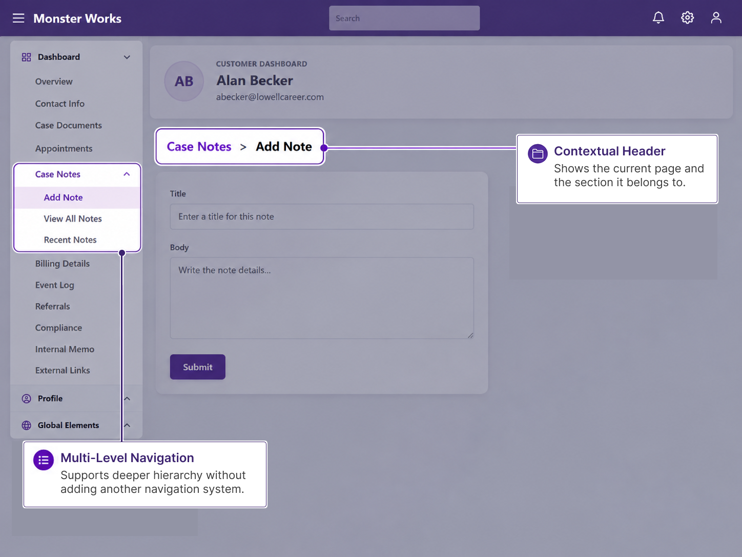
Sections can expand to reveal related destinations without adding them to the main navigation. Here, Case Notes contains Add Note, View All Notes, and Recent Notes. The page header carries that same structure into the content, identifying the current page as Case Notes > Add Note.
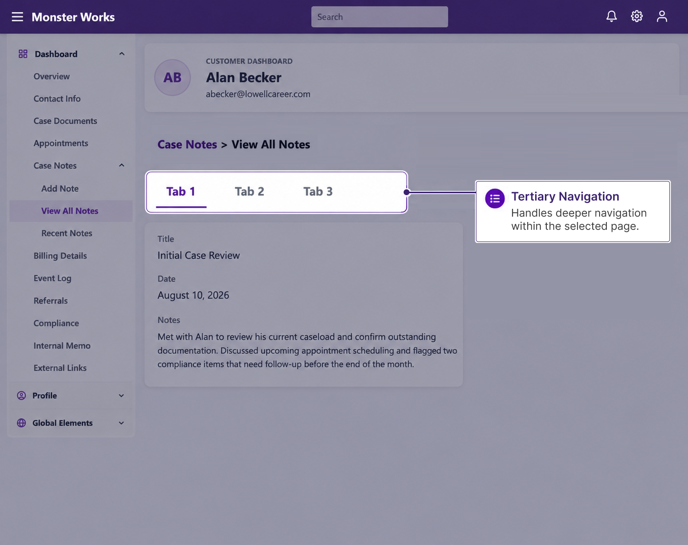
When a destination contains multiple sections, tertiary navigation organizes them within the page. Here, View All Notes contains three sections, so tabs let users move between them without leaving the current destination. Pages without multiple sections, such as Add Note, don't need this additional navigation level.
The navigation model was part of a broader effort to establish reusable patterns across the platform, but redesigning the architecture was only part of the challenge. Introducing it into a mature platform required an incremental rollout that could expose integration problems without destabilizing core workflows.